Secend
Making waste the most important thing to buy.
In Switzerland, one-third of all food ends up in the trash. Secend is on a mission to change that. Together with producers and wholesalers, they rescue surplus food before it’s discarded and make it accessible to everyone.
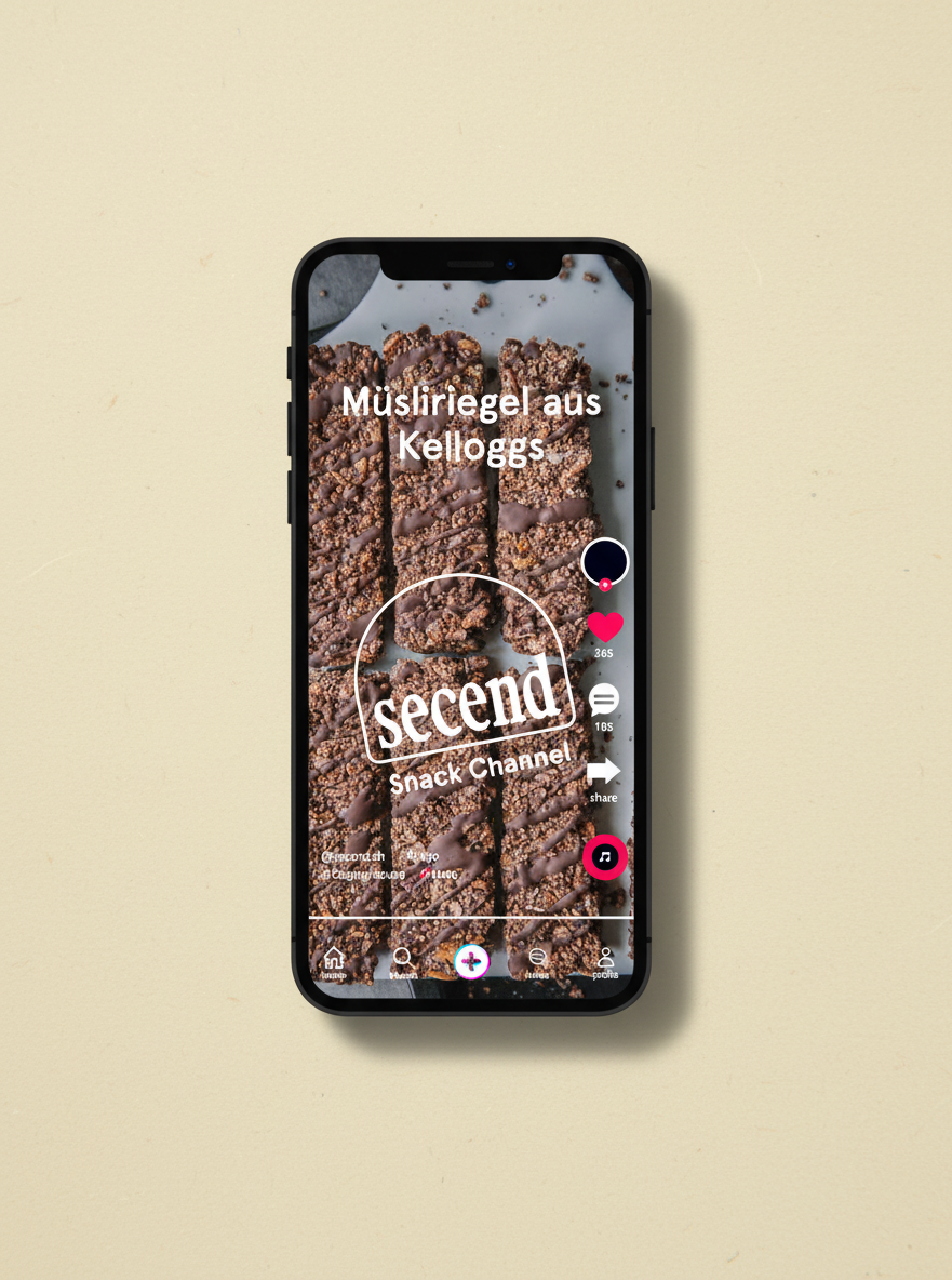
The redesign of their webshop was an opportunity to sharpen that mission visually and strategically. The goal was to create more structure, strengthen the brand story, and introduce a new content category dedicated to food waste — featuring interviews, recipes, and inspiring insights that position Secend not just as a shop, but as a voice in the conversation.
Disclaimer: This project was unfortunately
stopped just before the finish line.
BRANDING
Illustration
WEBSITE
Custom Merch
PACKAGING


A key part of the redesign was reimagining how Secend’s orders are presented. The solution needed to be simple, cost-conscious, and scalable. Instead of investing in complex packaging systems, we developed a flexible sticker concept. By combining different shapes and messages, each order gains its own personality — making every delivery feel unique and turning the unboxing moment into a small, joyful surprise.
The visual language builds on newly defined shapes inspired by details of the typeface. These shapes became a consistent design element across the entire system — from the webshop to social media to packaging — creating a cohesive identity with character and warmth. Together with refreshed typography, vibrant colors, and animated illustrations, the brand gained new energy and a versatile toolkit for all channels.